
 It's rainin' men!
Written by: Jody Leheup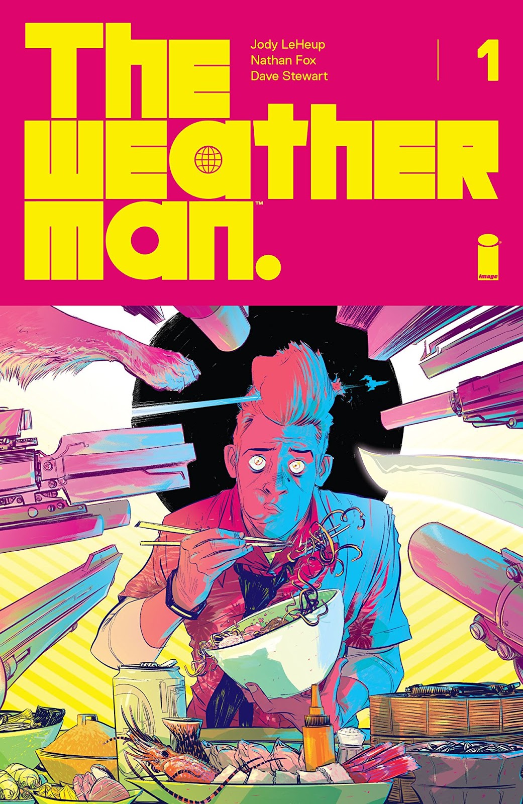
Art by: Nathan Fox
Colors by: Dave Stewart
Letters by: Steve Wands
Designer: Tom Muller
Publisher: Image Comics
Publication Date: 13 June 2018
You know that scene in Hondo where John Wayne asks the six-year-old he's standing fishing with, "Whaddya mean ya can't swim, what age are ya" and the little cute kid looks up and says, "Six". The Duke's eyes pop out of his head and he exclaims, "six!" and grabs the kid and chucks him straight into the river. Wayne shouts, "pull the water towards you and kick!". The kid arrives safely on the other side of the river, "look at me, Maw! I can swim!!". That's how this book starts you off, it doesn't teach you gently, it throws you right into the comic book river like Hondo. So let's pull the water towards us and kick our legs!

This first issue of this series really just hurls you straight into the setting on Mars 2770. Now one reservation I had about this was that things didn't seem to be that different from Earth 2018. People generally seemed to wear the same type of clothes, they drive land-based cars, live in apartments and use cell phones. So there was a slight tendency to flick back the pages and do a double check of that date. Leaving that aside though the rest of the setting and environment is intriguing. Mars 2170 might have worked better to get me buy-in.

The wider concept here is that Earth has died and therefore this colony is Earth on Mars. Our titular Weatherman is a pretty zany, disorganized character who is attached to his dog, and seems to have a cult following. He also has successfully secured a second date from the other lead character Amanda. A date that has something of a surprise ending. There are good dialogue and humor that comes across in the issue between Nathan (the Weatherman) and Amanda. It's a pretty funny book at times as well as having an overall action feel.

The finest thing about this new title is the art. It really has great detailed character work, the faces are very expressive, it is wispy and delicate and quirky and I liked it. The colors from Dave Stewart lend a futuristic vibe to it as well as producing colors that really pop off the page. Particularly good use of orange, yellows, and neon in the issue. Very pleasing to the eye.
Bits and pieces
There is quite a bit to enjoy in this first issue. Yes, I had a bit of a push to get over the fact that technology hadn't moved on that much in over 700 years. Leaving that aside though, and adding a little extra suspended disbelief this is a great first issue, the art is great and it is highly enjoyable. The ending draws you in and will have you wanting to pick up the next issue.
No comments:
Post a Comment