
 So Big...It's Giant!
Written by: Michael Gray and Steve Orlando
Art by: Ryan Benjamin and Tom Mandrake
Price: $4.99
Price: $4.99
Release Date: Available at Walmart now, in Local Comic Shops with a different cover on October 9, 2019
Of course, the biggest name in comics would have an entry-level book! Batman’s been on Walmart shelves as long as DC has had this program. In fact, last March had a special 80th Anniversary Giant, a sampling of reprint stories going all the way back to Detective Comics #27 and touching on the different eras of the Caped Crusader. For a cool $30-50, I can getcha one on eBay!
COVER: Leave it to DC to use a cover that is largely a silhouette! Of course, we all know the cape and cowl...who needs to see a face? DC wisely adds icon-like images at the top of the Giants listing the featured characters, and this issue promises Batman, The Joker, Harley Quinn, Robin and Clayface. Down further on the page, we get special mention of Batwoman. A robust lineup.
Remember, this is the Walmart "mass market" cover. The "direct sales" cover available in local comic shops is different, showing Batman all wrapped up in Clayfacey goodness.
BATMAN AND CLAYFACE in “Bad Actors” (16 pages)
Written by Michael Gray
Pencils by Ryan Benjamin
Inks by Richard Friend
Colors by Alex Sinclair
Letters by Troy Peteri
A classic Batman short story drawing upon his detective roots. We kick things off with a three-page car chase resulting in Batman catching a celebrity on the run over suspicion of murder. Great action shots abound. With the suspect apprehended, Batman and Gotham Police Commissioner Gordon discuss the likelihood of the suspect being set up. A little detective work, and Batman has found the real bad guy to be none other than Clayface. A little explanation/exposition ensues, and Clayface engages Batman in a fight through a fire-filled theater. Batman escapes, leaving Clayface to harden up in the heat. Once the fire subsides, Clayface breaks off the outer shell and escapes to fight another day.
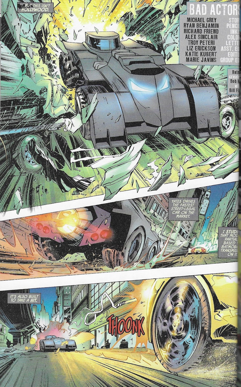
Oh, how I loves me a good car chase. And this is a great one!
Short stories like this are so hard to piece together but, when done properly, are quite fun to read. Gray threads the needle and gives us just enough plotline, just enough action and a proper narrative arc to leave the reader fulfilled. The tradeoff in a one-shot like this is that you witness no meaningful character development, and this story lacks just that. I don’t see that as a reason to downgrade the story, but that’s only because of the iconic nature of Batman and the largely correct presumption that the reader knows who Batman is, what his skills are and what his basic motivations are.
Gray’s script is tight. No extra verbiage, and a reasonable tradeoff between spoken word and narrative box exposition. I’m not super-familiar with Clayface, but the dialogue throughout seemed true to character.
While the story was good, it was perhaps exceeded by Benjamin and Friend’s art. They draw a robust Batman, more from the Jim Lee school than the leaner Byrne or Perez versions. Together, Benjamin and Friend create a terrific layout combining great action shots with the dialogue needed to move the story. They even threw in a little detective work in the strangest place -- ever seen Batman raid a vacuum cleaner bag for clues?
I have to give special mention to the action sequences. We have fast cars, explosions, leaping and swinging all over as Batman tries to stay two steps ahead of Clayface. The artists use the entire page (no margins in this book!) to their advantage in this respect.
Colors appear to be digital, and they are vibrant when needed. Car headlights, the well-lit Bat signal, sepia-toned backstory...and then the fires and explosions of the climactic fight are all outstanding.
All in all, a very satisfying opener. 8.5/10. How about four more stories?
BATWOMAN AND LORD DEATH MAN in “Unstoppable” (8 pages)
Written by Steve Orlando
Drawn by Tom Mandrake
Colored by John Kalisz
Lettered by ALW Studios’ Troy Peteri
Weird Science readers and listeners know that when Steve Orlando steps in, it’s time to cue up Jeremy’s Orlando Zone. But where’s Jeremy? Ack! I’m alone on this one. Will your novice reviewer be able to discern whatever it is that Orlando is trying to convey? Read on, dear reader!
With only eight pages, Orlando doesn’t have time or space to write a treatise on super-heroic motivations. But he DOES have a character in Lord Death Man who, while new to me but apparently part of the DC Universe since 1966, can bring the monologue with perhaps one of the best villain names in comics. And can you blame the guy? It appears that LDM was launched into orbit on a WayneTech satellite! The bird has crash-landed, conveniently in Gotham City, and LDM has a score to settle with Bruce Wayne: “You left me to orbit in Hell. Now, as thanks, I’ll bring Hell to you.” That’s what we in the business call character motivation. And the overwrought Lord Death Man dialogue, perfected over lord knows how many geosynchronous orbits, just rolls off the tongue.
Batwoman steps up to intercept Lord Death Man, and then we see his escape from the satellite and rampage through the streets of Gotham. He tears through the GCPD as so much tissue paper...but what about Batwoman? She throws everything in her toolbelt at LDM, but nothing seems to work. Time to land some body blows! A couple well-placed punches, a little wrestling and Lord Death Man is captured once again. Not in a space satellite, but definitely unorthodox. Let’s close it out with a Steve Orlando Batwoman monologue, and end scene.

It takes everything in the arsenal to bring down LORD DEATH MAN!
Is it the Steve Orlando we know? Oh yes. Is it easier to take in eight-page bites? Yup! I was not driven to distraction as I have been with other books that he has written, and he kept the pacing going such that the monologues came as reasonably appropriate times.
Orlando gets points for creating a reasonable backstory to why this conflict is taking place, and his closing talk by Batwoman reinforces the unique nature of the character. Not bad for eight pages.
Tom Mandrake is a name I know from back in the day, meaning that he has forgotten how to draw more than I’ve ever learned...and he’s still drawing professionally for DC. His character work, with the Ghost Rider-skeletal Lord Death Man and the masked Batwoman, is reminiscent of the recently departed Ernie Colon. I wouldn’t say that I enjoyed the layouts as much as in the prior story, but I was able to follow the action with no problems.
Coloring, again digital, is muted when compared to the Batman/Clayface tilt. I note many more solid colors, reminiscent of the 80s books that I grew up with. Muted, solid colors work well in a moody Bat-story.
So it wasn’t the Clayface fight, but it’s still worth a 6.5/10. On to the reprints….
BATMAN in “The Court of Owls Part 1: Knife Trick” (26 pages)
Written by Scott Snyder
Pencilled by Greg Capullo
Inked by Jonathan Glapion
Colored by FCO Plascencia
Lettered by Richard Starkings and Comicraft’s Jimmy Betancourt
Remember the “Court of Owls” storyline from way back at the beginning of the New 52’s Batman #1 in 2011? I don’t! It’s all new to me! Let’s see what everyone has been talking about.
In a nice touch that plays to the uninitiated, this story kicks off with a full-page written backstory paragraph about Bruce Wayne and how/why he became Batman. Wouldn’t have hurt to have that page at the front of the book rather than 30 percent of the way in, but we’ll roll with it.

Opening up a new series with a ton of villains is a very wise move.
Part 1 does everything a first issue is supposed to do: (Re)Introduce main characters, establish the conflict and set the stage for future development. We get to see Batman fight through his rogues gallery. We see billionaire Bruce Wayne with his wards and child, Robins all at one point or another. Wayne does his charity dinner routine, followed by a Batman detective spin through a GCPD crime scene where it’s established that Wayne’s life is in danger. A nice tight plot with dialogue to match. Well done, Scott Snyder.
Greg Capullo’s art is quite good. He uses the page well with creative yet appropriate layouts, and his character work goes with the “less is more” approach on linework. It works, in part because the coloring adds texture where he leaves white space.
This story isn’t the draw for a lifelong Bat-fan who knows Court of the Owls by chapter and verse. For a relative newcomer like me who is unfamiliar with the story arc beyond reputation, it’s a gem. And, provided I stick with the book for the duration, it’s an inexpensive way to get this story arc into my collection!
8.0/10.
HARLEY QUINN in “Harley Lives” (20 pages)
Written by Matt Kindt
Drawn by Neil Googe
Colored by Wil Quintana
Lettered by Taylor Esposito
Reprinting 2011’s Detective Comics 23.2 (point two? Uh...ok), we’re treated to a one-shot interlude in Harley’s crazy life. She’s just left the Suicide Squad and returned to Gotham. Reflection gives us Harley Quinn’s origin/backstory, the story of a miserable young college graduate who offers mental health assistance to the nasties at Arkham Asylum. One thing leads to another, and our idealistic young lady is one of the crazy crowd! The story ends with Harley pulling a crazy little Harley explosive stunt and meeting up with Squad partner Deadshot.
All in all, a simple story. Yet again (as appears to be a theme with this book), the one-shot story gives the writer time to do his thing for plot and action with a minimal amount of character development. Using the origin story doesn’t necessarily develop the character or add nuance but rather reinforces the basics of the character. It’s well done in this case.
Artwork is very clean, perhaps with a Japanese Manga feel to the character work. I’m not sure I like the sad/frantic clown look of 2011 Harley as opposed to the wild and crazy - almost gleeful - Harley that we get in 2019, but it’s consistent and perhaps adds a little to the origin story.
Keep that color focus on the important parts!
Colors are important and well-executed. The reddish sepia look to the flashbacks is perfect when key characters like Joker or the transforming Harley pop with color.
I’m guessing that this story probably doesn’t have the staying power of the Court of Owls, which makes it a perfect candidate to reprint.
7.5/10.
NIGHTWING in “Better than Batman Part 1” (20 pages)
Written by Tim Seeley
Drawn by Javier Fernandez
Colored Chris Sotomayor
Lettered by Carlos Mangual
Continuing the origin/first issue theme, we’re given a reprint of the New 52 Nightwing #1 (again, 2011 - I guess DC is big on reprinting New 52 content). It’s an interesting choice for an entry level book because the Nightwing/Dick Grayson character has undergone some traumatic changes in current-day DC continuity....so much that a reader of this story who runs off to the comic shop to buy Nightwing will be very, very confused. You really can’t say that about any other character in the 100-page giant. Problem is, Dick Grayson is more recognizable to new readers than most any other character in the Batman character world than anyone other than Batman or Joker. Alas.
The story is an interesting one in the context of this book. Whereas the Batman reprint story sets up a battle against the Court of Owls, Nightwing is operating as a mercenary/mole within the same organization. Was it wise to pick that pair of stories? Not sure. Regardless, we get the obligatory stop-in at the Batcave to visit with Batman and Robin (in this case, Damian Wayne), and then off to see Batgirl. There’s not much more room to do anything other than set up the next issue’s conflict with his shotgun-wed partner, Raptor.
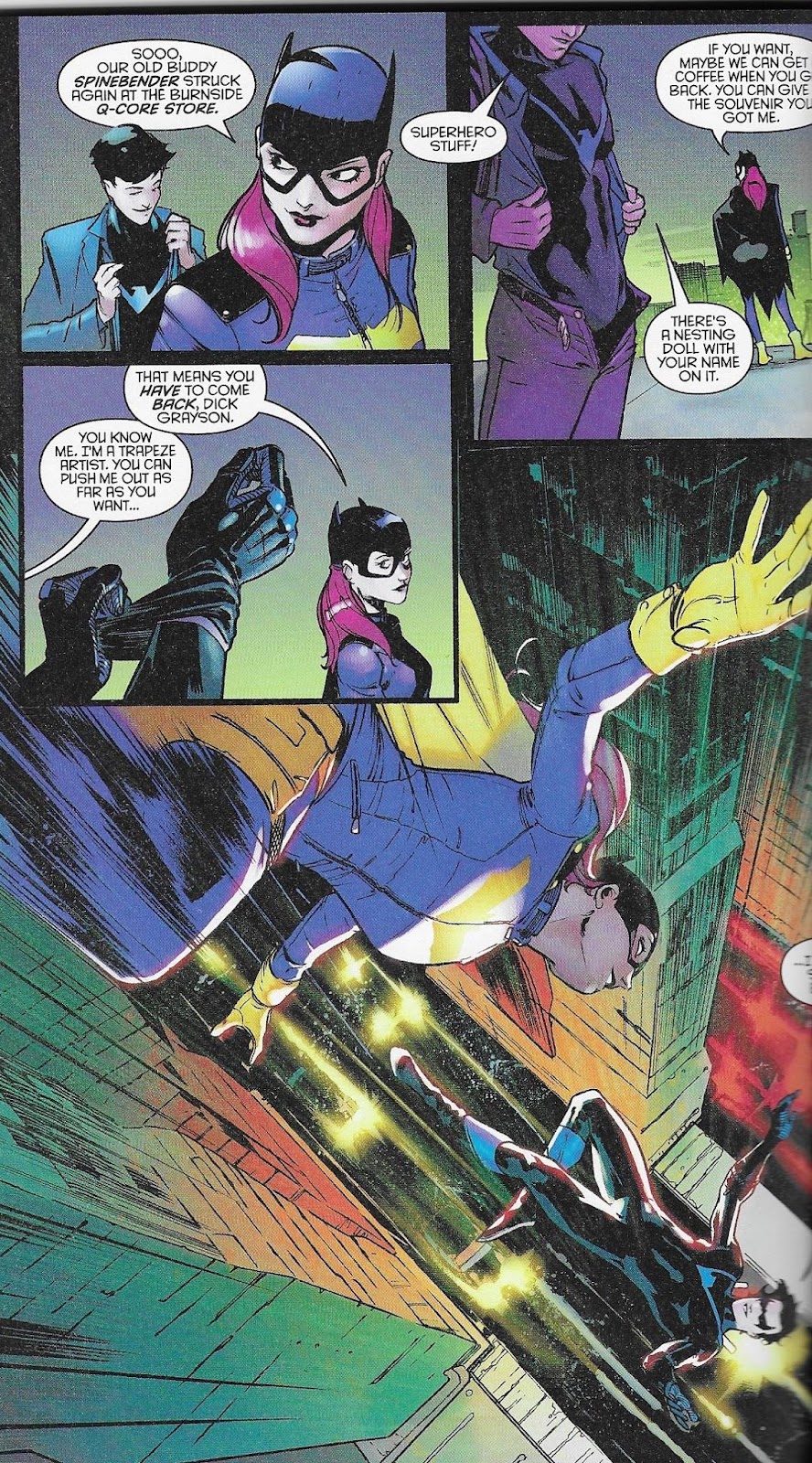
That’s not Dick Grayson at the top of this page, is it?
This is perhaps the only story of the book where I felt that the art was a drawback. The layouts were fine, but
the character work doesn’t fit what I’m looking for. This is especially profound on the drawing of a non-costumed Grayson, who doesn’t resemble anything I’ve seen before. Sorry, just not feeling it on this one.
It’s a decent story, one that has me interested in seeing if/how Nightwing can bring down the Parliament of Owls. I just wish the art was a fair bit sharper than it ended up. Let’s give the story a 5.5/10.
Four solid hits and one simply OK story make for a strong initial edition of the relaunched Batman Giant. The book is top-heavy with introductory and origin stories, which is perfect for new readers. It will be interesting to see how newbie-friendly the book remains over time. So let’s wrap this up by looking at the scores...
Batman/Clayface - 8.5/10
Batwoman - 6.5/10
Batman (Court of Owls) - 8.0/10
Harley Quinn - 7.5/10
Nightwing - 5.5/10
Bits and Pieces:
Sounds about right...a solid, enjoyable book that had moments of high quality and moments of simply being on the plus side of OK. But yes, I would strongly recommend checking out the Batman Giant #1...especially if you are an entry level comic reader!
7.2/10
NIGHTWING in “Better than Batman Part 1” is actually from the DC rebirth era not New 52 ;)
ReplyDelete